Bitmap Monogram
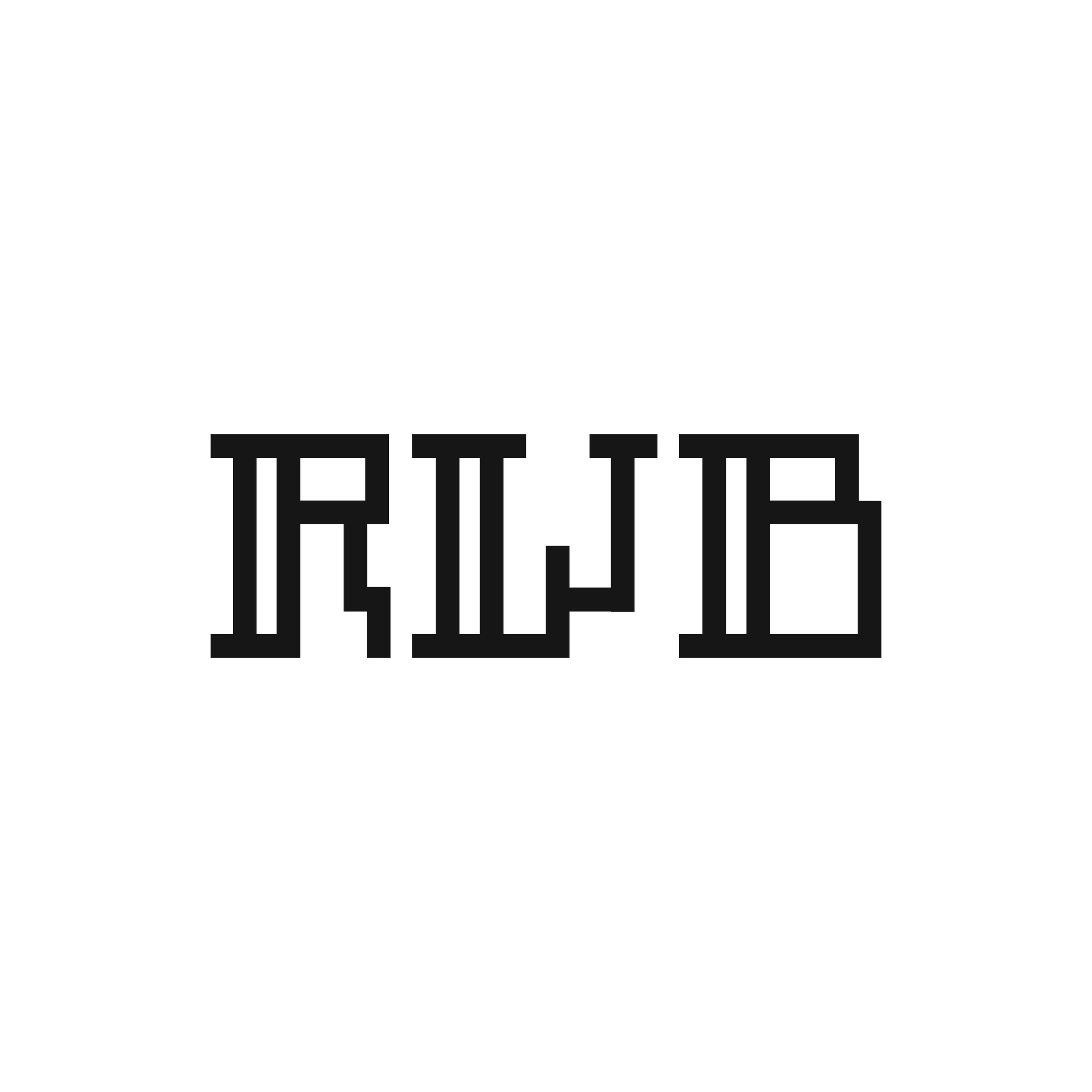
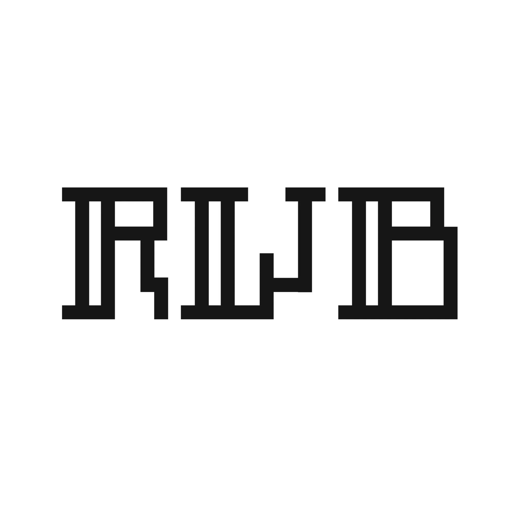
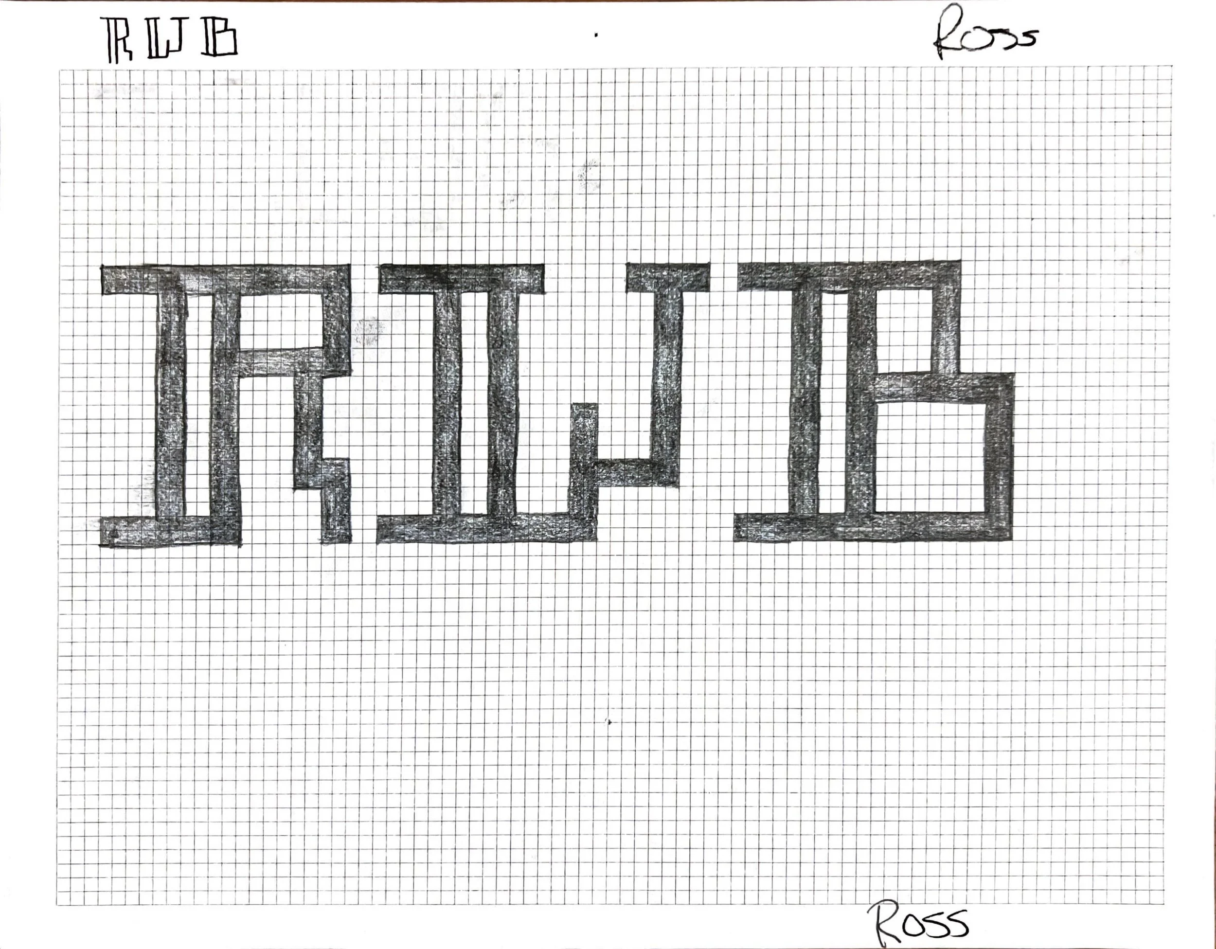
When designing a typeface, my main focuses are legibility, balance, and cohesiveness. Once those things are achieved, a strong font will emerge. While creating this three letter monogram, I was determined to create an easily legible, creative, and mildly stylistic font. The double vertical lines on the left side of each letter and the staggered x-heights add a subtle elegant style that brings it all together.

Original
Revised
In revising this project, I perfected the proportions of the “R” and “B” to have the same size closed counter. I also shortened the length of the spurs on the left side of the stems. This allowed for a more consistent letter width and cohesive appearance.


